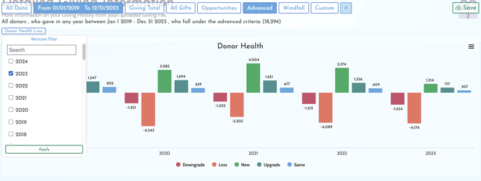
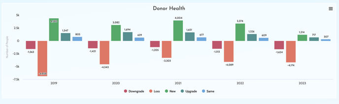
By tracking your giving history for upgrades and downgrades using the Donor Health chart on your GivingDNA Giving Dashboard, you can see how many of your donors year over year have increased their donations (upgrade), Decreased their donations (downgrade), Lapsed (loss), Given the same as the year before (stayed), or given for the first time or reactivated (new).
Beyond the ability to track how your donors giving is changing over time, you can also isolate each value in the chart by using the Donor Health filters in the Advanced filter and selecting the year you want to segment to save, track and download.