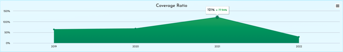
The GivingDNA Coverage Ratio chart tells you if you have acquired or reactivated more donors than you have lost in a given fiscal year. The formula is the number of acquired donors + reactivated donors/lapsed donors. If your ratio is greater than 100%, then your active file is growing, and if it is less than 100%, your file is shrinking. Let's say you had 1,000 active donors last year and this year 600 gave, so you lost 400 donors. In order to at least maintain the size of your active donors file you would need to acquire or reactivate 400 donors.